Let’s Talk About Fixed-Layout + Accessibility

What? Fixed-layout ebooks and accessibility? I bet you are wondering if I’ve lost the plot. I promise you I have not.
Fixed-layout ebooks are a flavour of EPUB that is inaccessible by its very nature. One of the hallmarks of accessible content is being able to change the font, change the size of the type, and to read with sufficient contrast, i.e., without a background image. None of these things are necessarily true in a fixed layout ebook. This means they are are not adaptable to reader needs in what can often be crucial ways.
So what gives?
I would suggest that there are lot of things that the average publishing house and production crew can do to make a fixed-layout ebook as accessible as possible under the circumstances. It won’t be perfect, it won’t pass any certification checks, but ebook developers can maximize the accessibility of the reading experience in a number of ways.
Image Descriptions
Include alt text. Make it robust, meaningful, and thoughtful. Include it for all images except for those that are decorative, in which case be sure to mark those pictures as role=”presentation”.
The image descriptions should come from people who are editorially involved in the book, not from the ebook developer at the end of the production chain. Editors and creators are those best positioned to describe the image accurately. And the image description should have an editorial review, particularly to measure some of the best practices, as described below.
In the context of children’s books, there is often a set of instructions to the illustrator. Consider preserving that information for later re-purposing as the image descriptions. When writing image descriptions for children’s books, bear these tips in mind:
The alt text should be considered an alternate narrative of the storybook.
It should not introduce new language, if possible.
It should be written at reading level.
It should copy the tone of the book to some extent — i.e., irreverent, funny, lyrical, etc.
Clean HTML
A certain EPUB export (*cough, cough* InDesign) makes an unholy mess of the fixed-layout EPUB export. It puts <span>s with inline styling and positioning information around every word on the page. It is overburdened and chaotic code. If I can’t get around starting from an InDesign-exported EPUB, I try to delete all that inline positioning and styling, leaving the positioning information only at the <div> level. HTML like this:
<span id="_idTextSpan001" class="CharOverride-1" style="position:absolute;top:-88.1px;left:811.89px;" lang="en-US">bear </span>
Becomes:
<span id="_idTextSpan001">bear </span>
I generally maintain the <span> id in the event that media overlays will be applied to content. The next step is to place the paragraph(s) that this word is in into a <div> or, even better, a <section> with the positioning information there or, ideally, in the CSS called by a unique class or ID. The unruly HTML on the top, becomes the much saner HTML on the bottom in these screenshots.

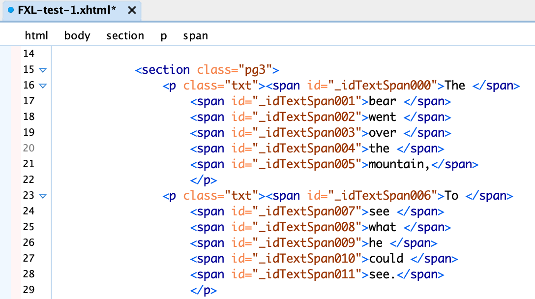
Notice that I simplified the inline formatting on the <p> tag, and deleted all those unnecessary language declarations.
Semantics
It is common to use DPUB ARIA in reflowable ebooks but not as much in the fixed-layout format. Don’t be afraid to mark the parts of the book, no matter how simple structure of it is. There are many epub:type semantics that can be used — copyright-page, dedication, titlepage — in addition to ARIA roles. Be sure to add ARIA roles like role=”doc-toc” and role =”doc-pagelist” to the toc.xhtml file.
Logical Reading Order
Pay close attention to the reading order. Some EPUB authoring systems will order items in the HTML incorrectly. Be careful to organize items on the page so that captions are grouped with the images, the linear flow of the narrative works, and secondary material is marked as such in an <aside> or similar.
Other Fixes
Move the language tag to the root HTML element.
Add a meaningful title to the header, even if it’s just “page one”.
Consider streamlining busy pages where the text is on top of an image. While re-thinking the design may be out of scope, be mindful of busy backgrounds and text legibility.
Read Aloud
Embedding read-aloud narration with word- or sentence-level highlighting is a very nice thing to do for readers, particularly early and dyslexic readers. Reading along while the words are highlighted is a nice learning-to-read aid, and one that is of particular important to readers with learning disabilities.
Go a step further and create a read-aloud that incorporates the image descriptions. See, for example Bruce Simpson’s book, Paislee and the Talking Tree. Read more about the production of that title on the Typeflow blog and here.
What Am I Missing?
I’ve tried to think through all the tiny and large things that developers can do to level up their fixed-layout ebooks. What have I forgotten? Please let me a comment or email me with your thoughts.
Resources
“Fixed layouts” on the Daisy Knowledge Base.
“Introduction to Accessible Ebook Production: Fixed Layout Format,” on the Accessible Publishing Learning Network.
“Field Guide to Fixed Layout for Ebooks,” BISG publication, updated for 2023.